Renew your library for less...
Reuse of library furniture reduced budget by 35%
The renovation of Verrières-le-Buisson Public Library near Paris in France began in 2018. Our BC Intérieur team in France suggested reusing several items of exiting furniture instead of buying a completely new package of products. The library, convinced of the benefit of up-cycling bought into the idea.
Furniture which could be upcycled or reused was integrated into the new scheme which enabled the municipality to save more than a third of the planned investment.
We were happy to manage the design and specification process for this project which had a wider financial benefit for the municipality of Verrières-le-Buisson.
Coherent design and functionality
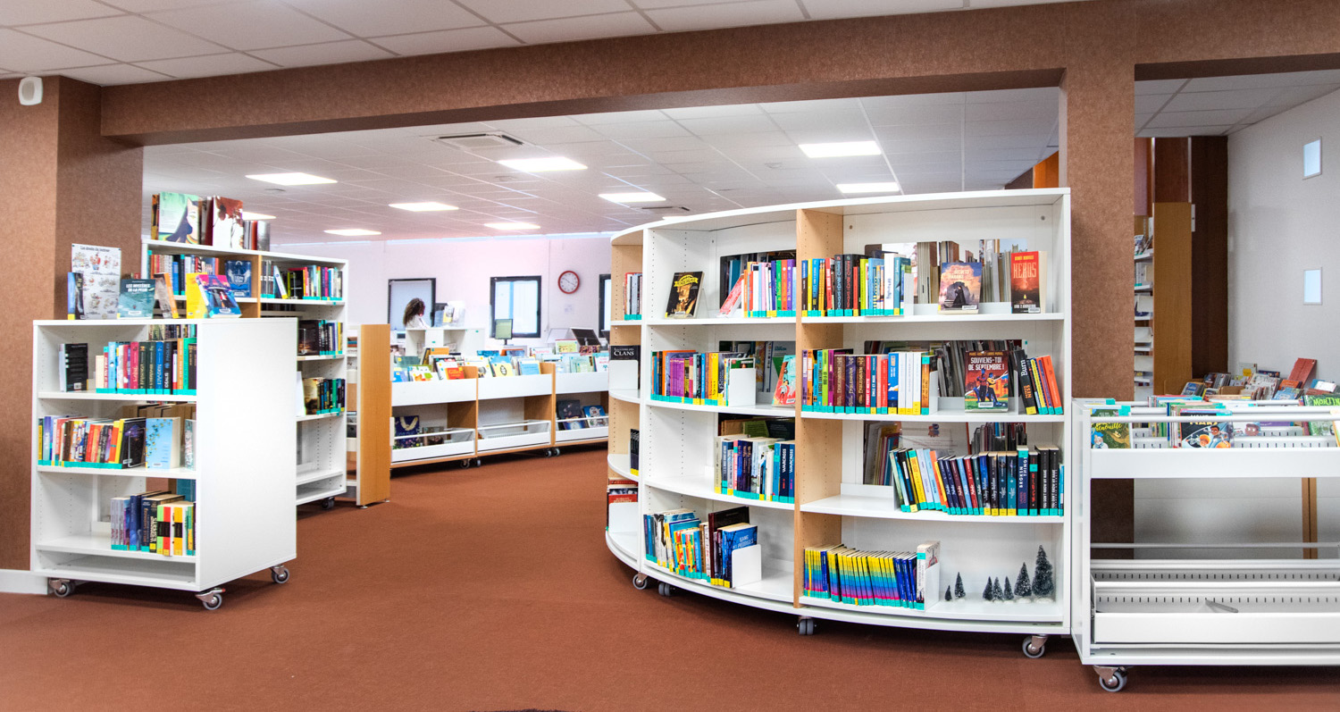
Our design of Verrières-le-Buisson Library ensured coherent design and functionality of the new space. The new layout reflects the functionality of a modern library with relevant organisation of facilities, books, media, and zones.
Existing shelving and book browsers were upcycled, adhering to a very clear design vision that was to improve accessibility and flexibility - key requirements of the original design brief.
We worked closely with the client advising on fresh decoration to the fabric of the building, including new paint schemes and flooring as these elements had to tie in seamlessly with several items of reassigned shelving and furniture.
The following images demonstrate the major changes, and the considered upcycling and re-assignment of shelving and furniture at Verrières-le-Buisson.

A blend of contemporary shelving
Prior to the library refurbishment, books and media were housed on static, straight shelving stacks with open tops promoting a cluttered look to the space.
Regimented shelving stacks were a mixture or 152 and 182cm high and required reconfiguration (hard to achieve with static shelving) to tie in with the new vision and zoning of the space.
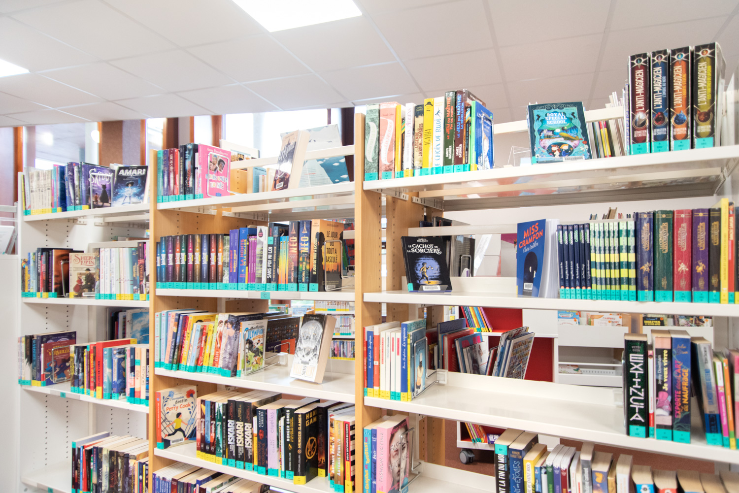
During re-furnishment we retrofitted locking castors to the shelving bays creating flexibility across all shelving, allowing for re-configuration at will. We also fitted canopies to the panel-based shelving to encourage a streamlined, premium high street image offering additional front on display space, encouraging browsing and reader centric design.
Additional panel based, mobile, curved shelving has been integrated into the layout complementing the “now upcycled” original shelving using similar colours, materials, and aesthetics.
We were mindful of creating a constant, suited look throughout and making sure all shelving, new and old, were the same height. Attention to detail is highlighted through the custom increased height of the new curved shelving in order to match the increased height of the original shelving due to the addition of castors.
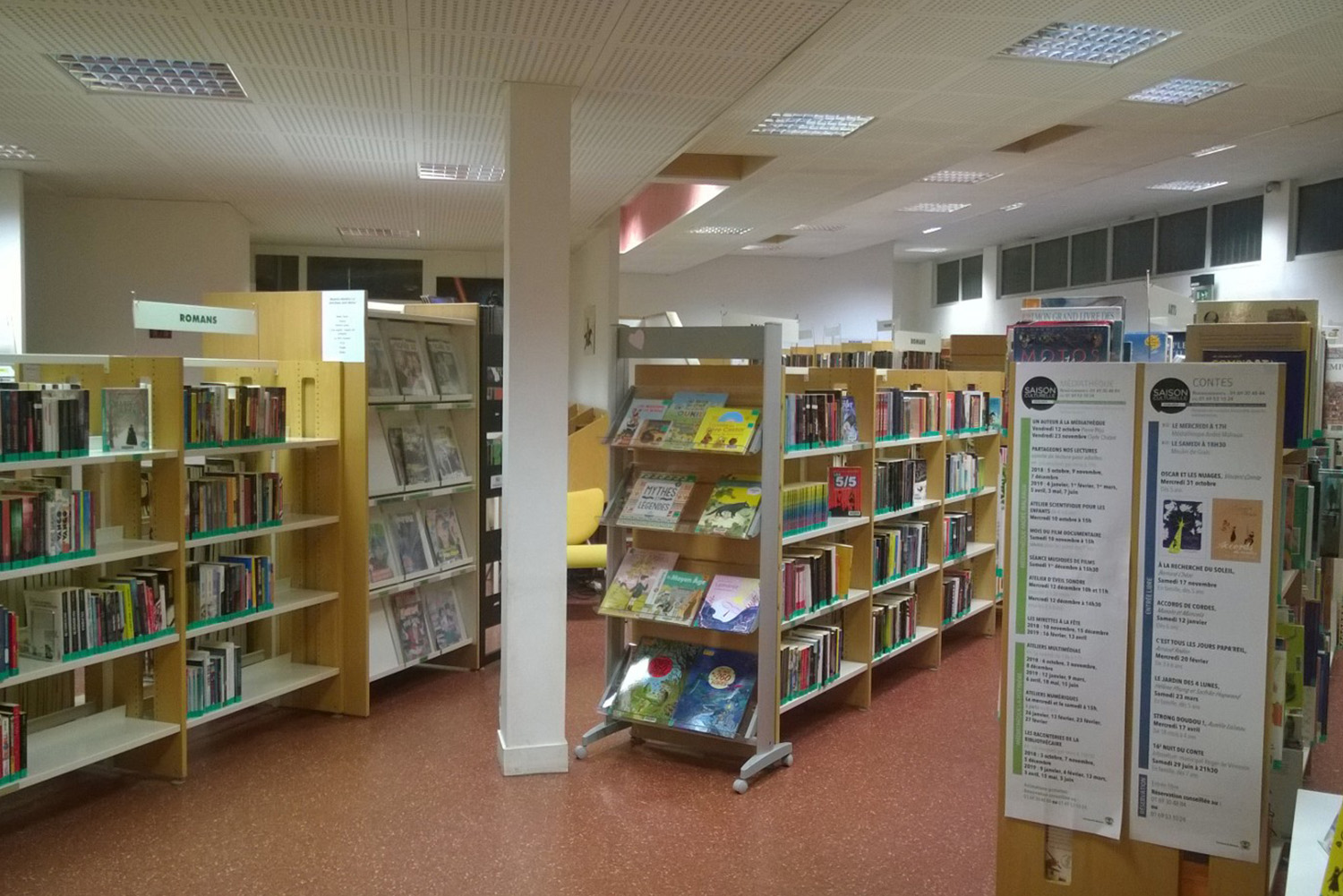
Before upcycling – narrow, dark layout
Before upcycling – no top plate
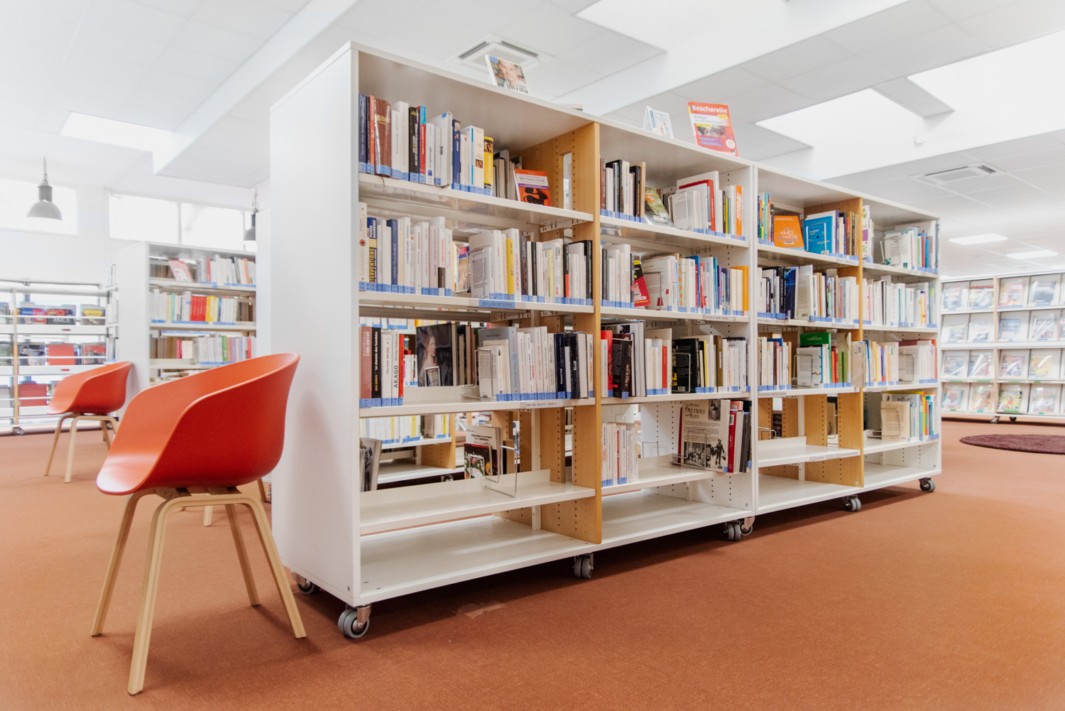
After upcycling – with top plate and castors
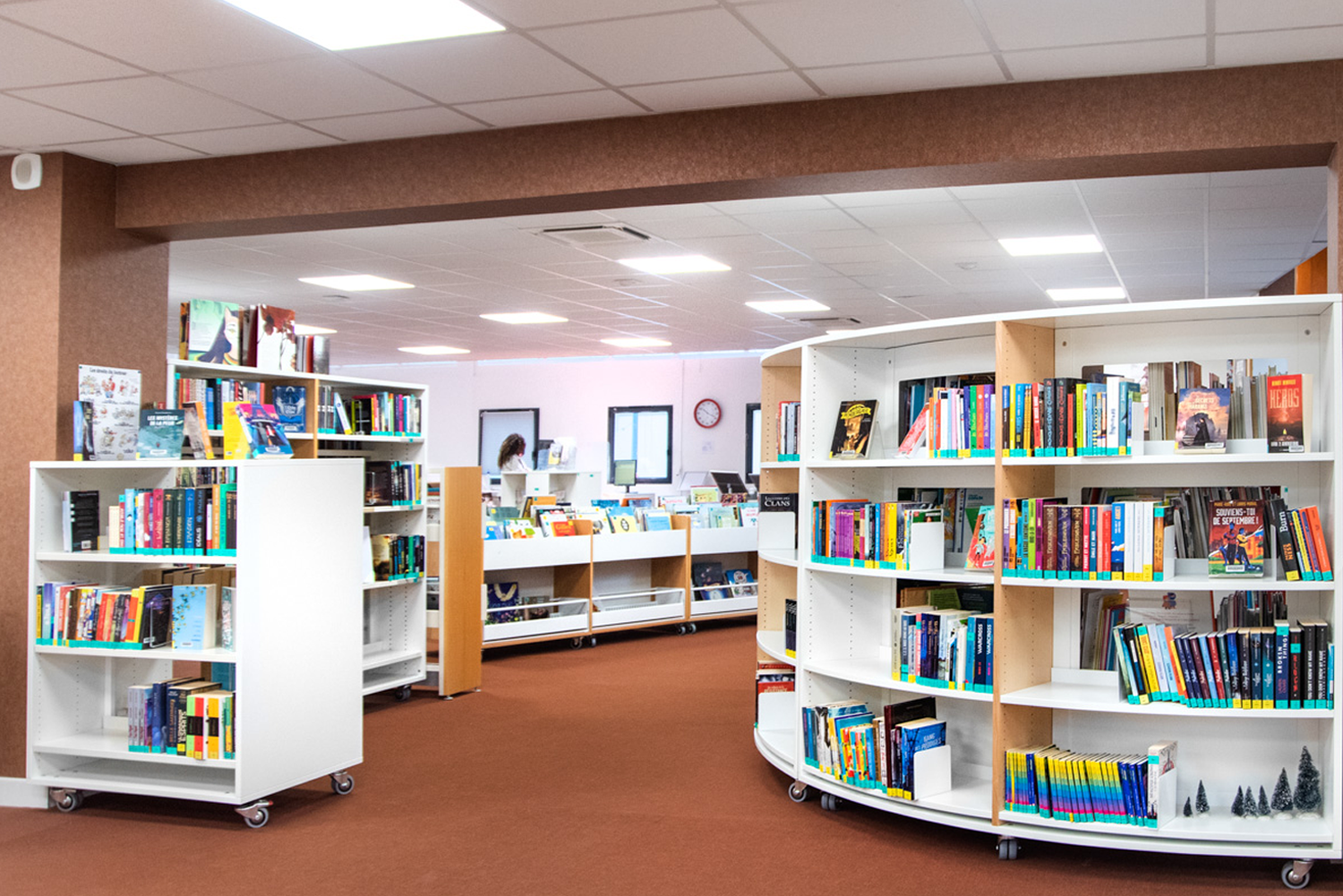
After upcycling – new modern layout
Accessible browsers
In the original regimented, linear children’s library, single sided, static browsers were clustered together offering little flexibility for creating a multi-use space.
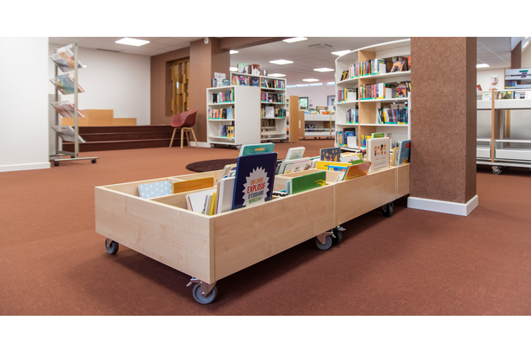
To overcome the above, we upgraded the browsers by fixing them back-to-back and adding locking castors for ease of movement. This enables library staff to easily reconfigure the space and welcome larger groups of children for reading events, classes or simply be able to create space for children to have fun.
In addition to making the browser units mobile, we retrofitted pull-out browser units to the lower sections making large picture book more accessible.
There was also scope across the adult library to improve accessibility of browsing materials and media by replacing fixed browsing units with pull out browsing units. This, in combination with standard fixed browsers enabled all internals to be positioned closer together, allowing for addition stock to be housed.
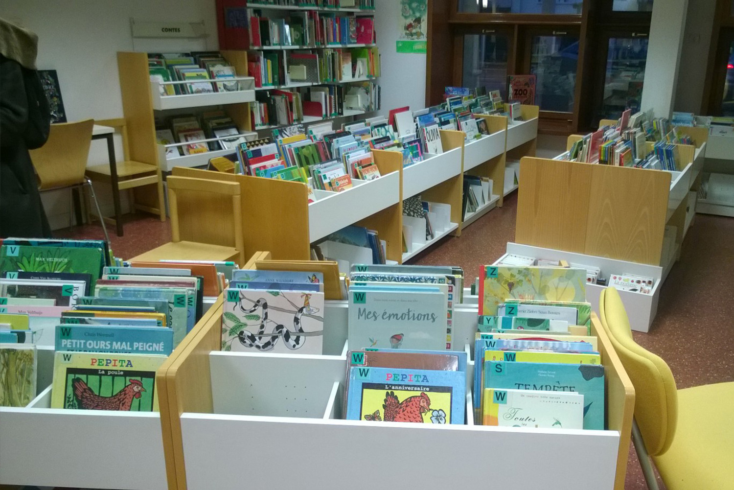
Before upcycling – single-sided browsers with levelling feet
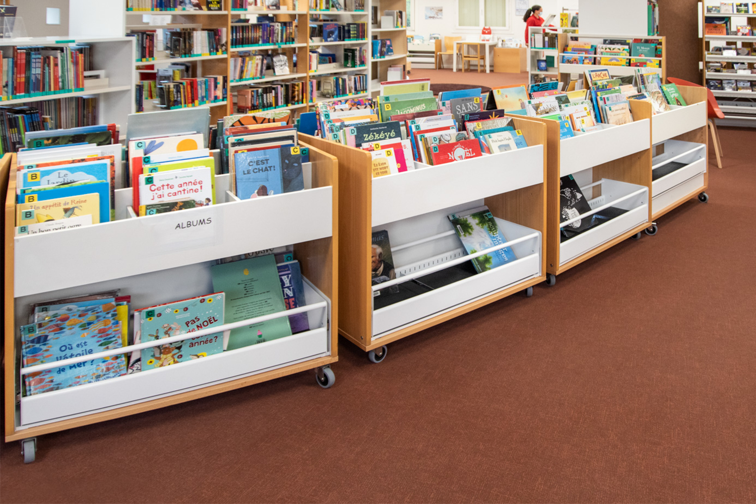
After upcycling – combined browsers with castors
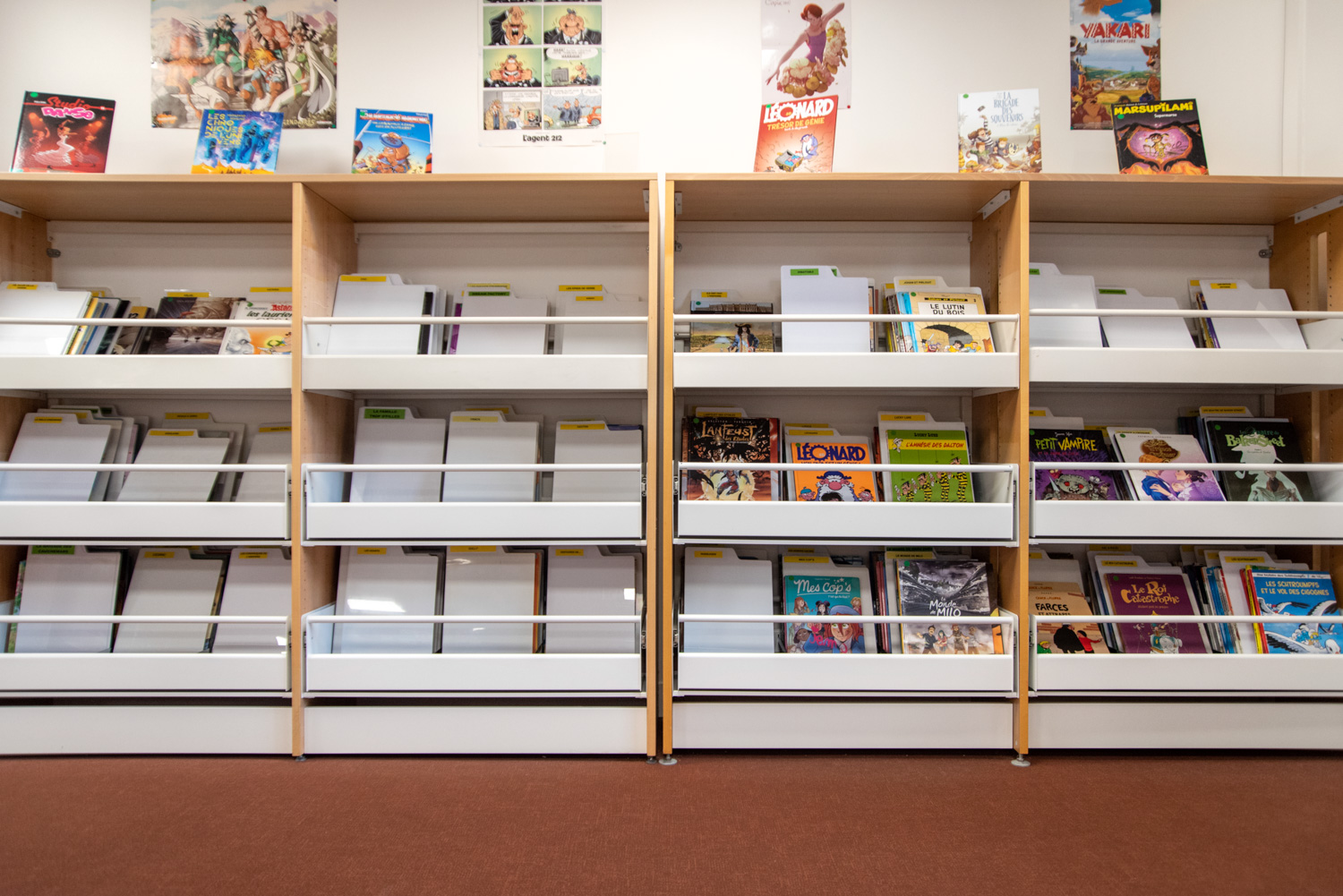
After upcycling – browsers with pull out.
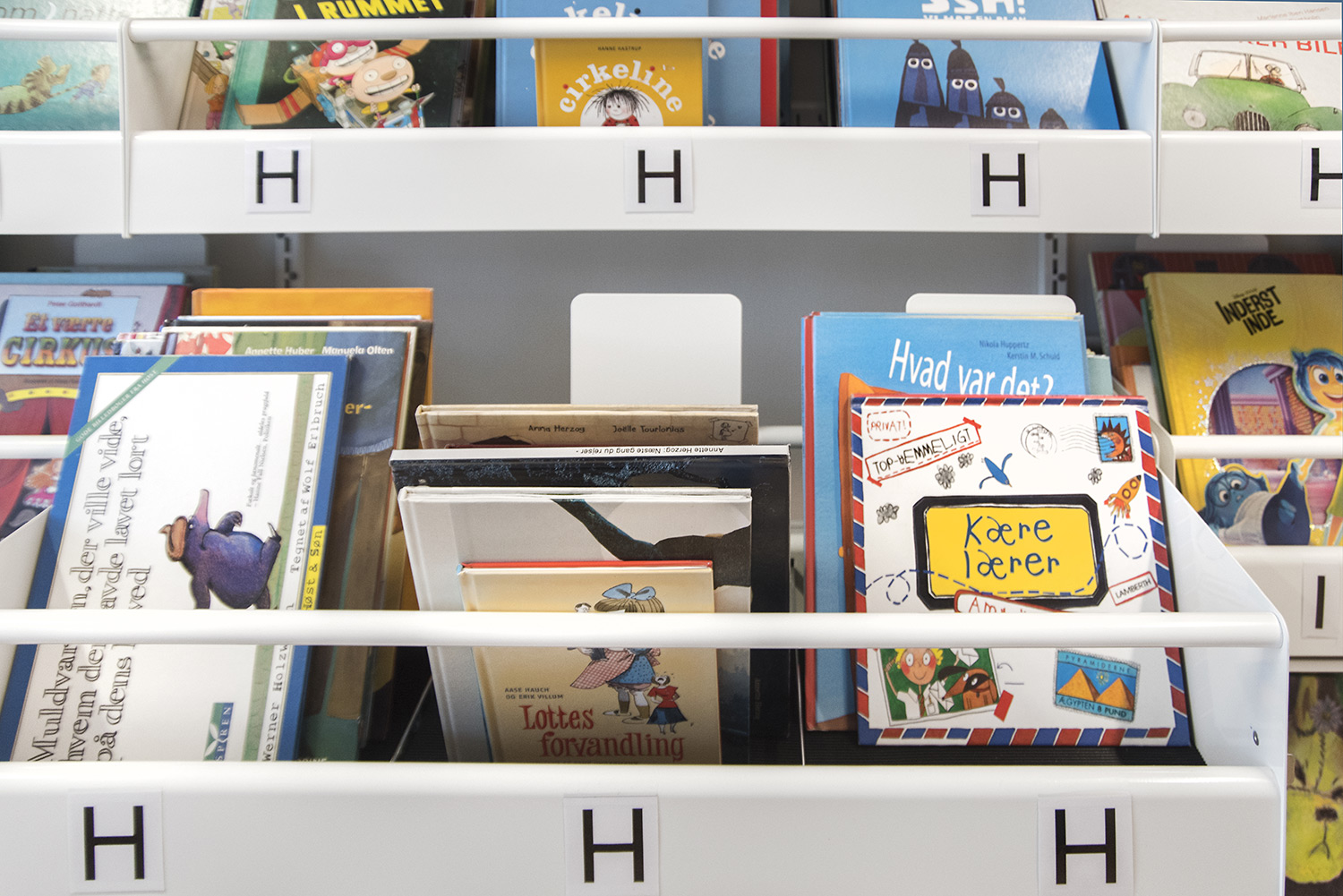
Close up example of pull out section (picture from another library)
New needs and new elements
A key design focus of the project was to create a contemporary contrast between the old and new, and to optimize the use of the space. A major contributor to this was the inclusion of two new staff pods removing the need to have a large, fixed, cumbersome counter at the main entrance.
A key service in modern libraries today is the use of self service. The technology required to offer this service must be considered when planning a library. To this end, the use of the two staff pods positioned in the centre of the library allows visitors to move, browse and “self-serve” freely at the main entrance.
The modern colours of the staff pods make them visible to users, and the inclusion of a recessed front panel makes the pods more easily accessible for wheelchair users, or users with limited mobility.
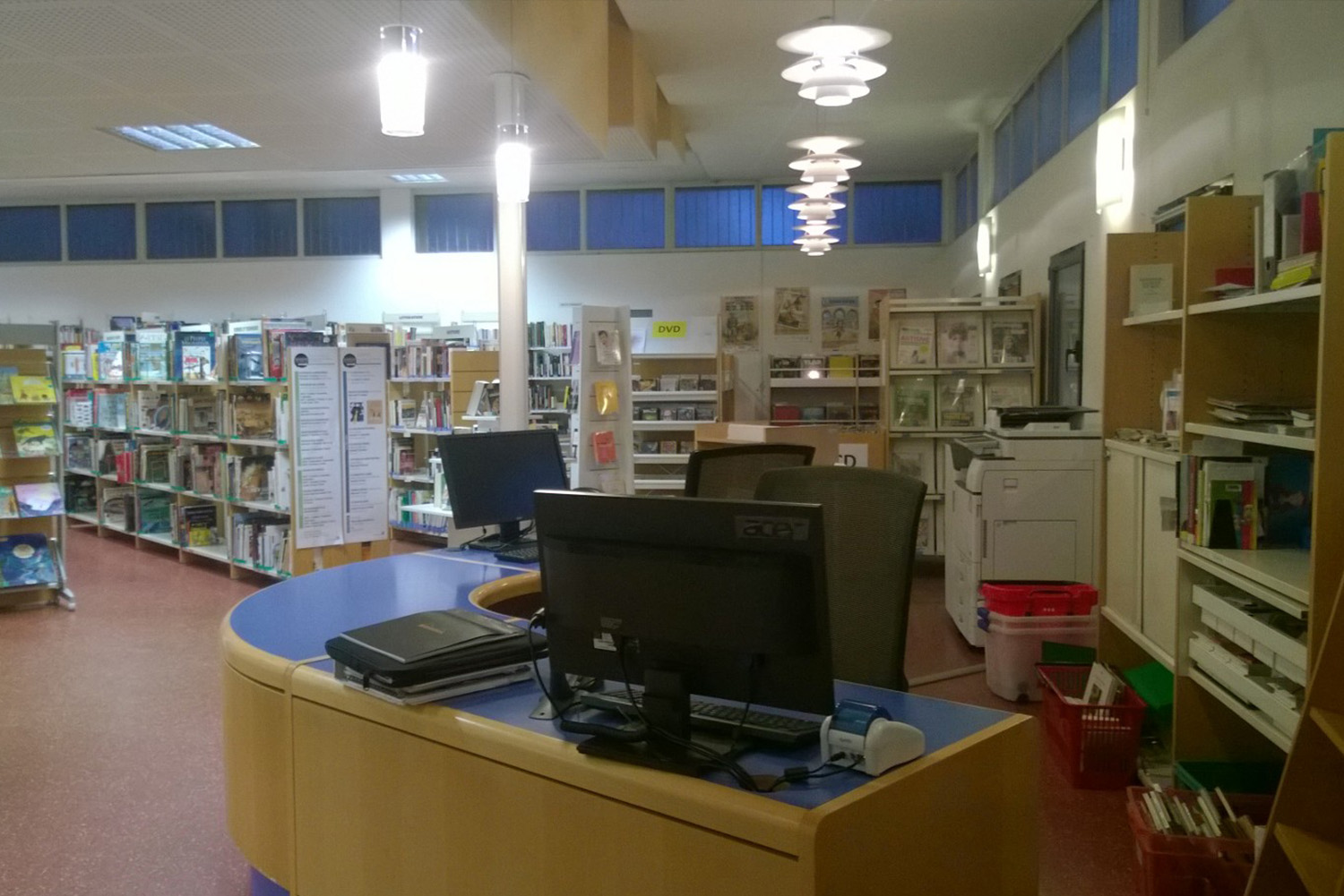
Before upcycling – fixed counter at the entrance
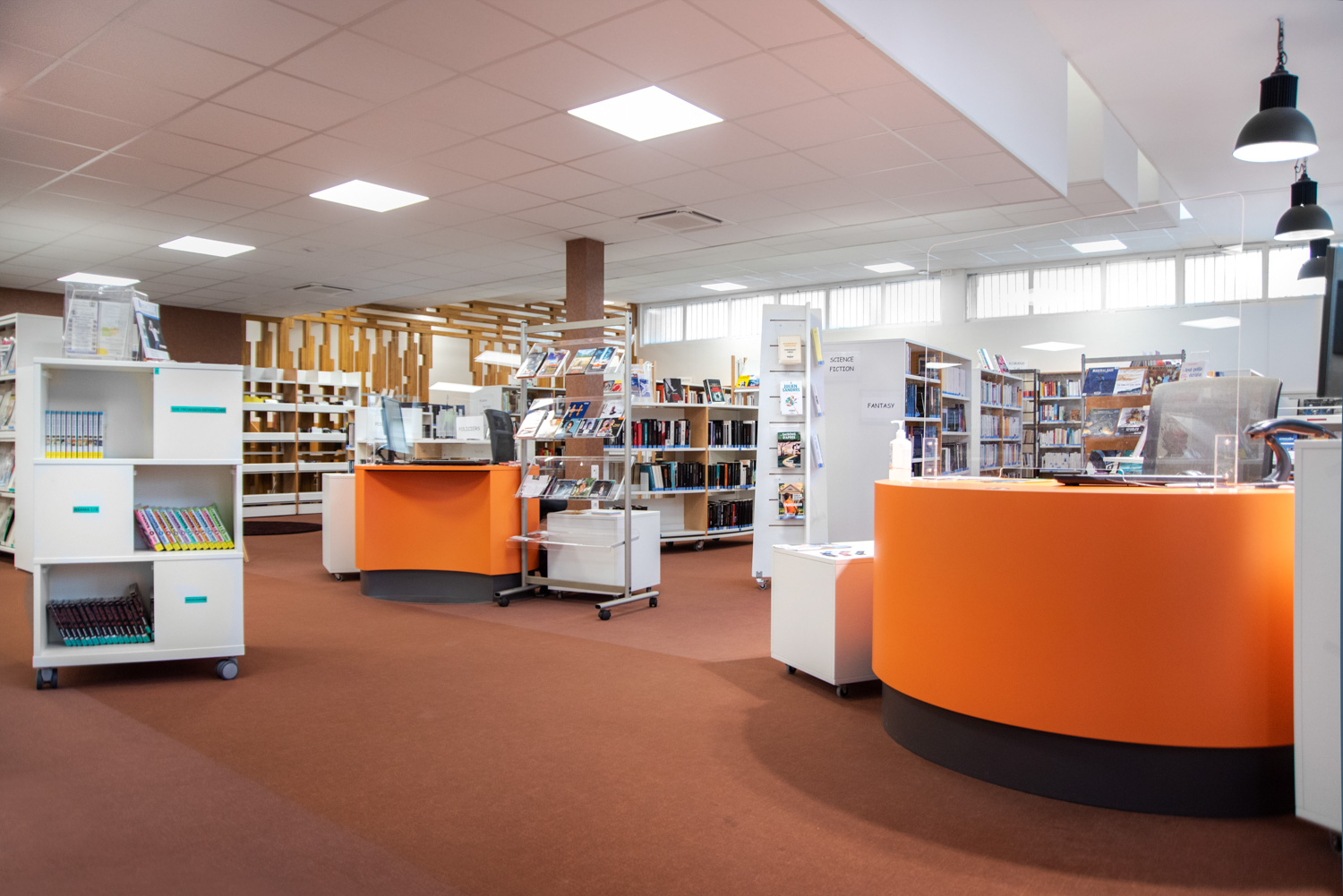
After upcycling – info pods in the middle of the library
The core of the library has naturally become a collaboration space where staff and library users can meet without blocking the main entrance. The mix of reassigned and new flexible furniture and shelving creates a dynamic and manageable space for all visitors and staff.
New display products, such as the Labyrinth tower and Emma podium have been introduced to support a more contemporary, high street browsing aesthetic and match the combined materials, colour scheme, and aesthetics of original products.
We have also introduced new seating to the library to add a sense familiar, domestic, contemporary modernity to the library. Included in this selection is the Hay compact tub chair as shown below.
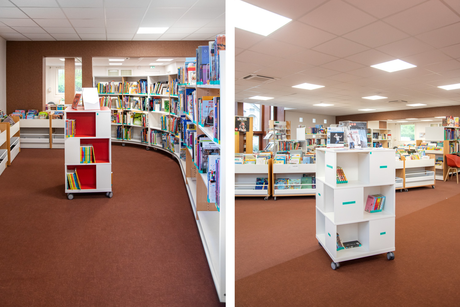
New products – Labyrinth
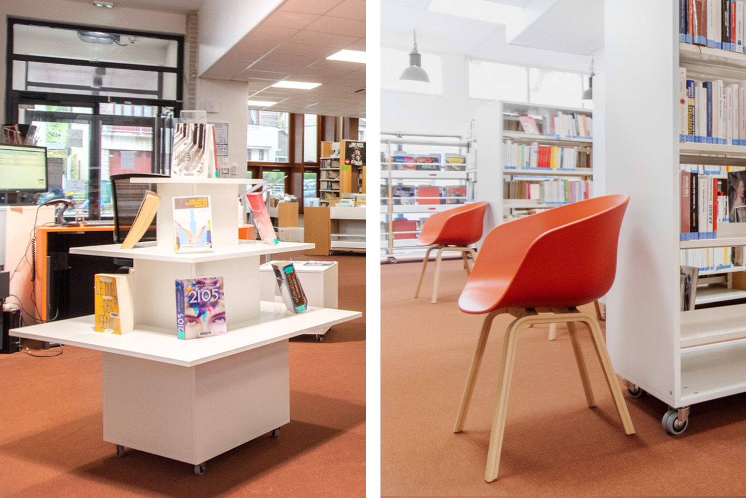
New products – Emma Podium and Hay chair
Reduction of environmental impact
We embrace the growing focus on “Green” public procurement. The project in Verrières-le-Buisson is an example of a refurbishment project where sustainable thinking positively influenced the budget. This said, we must consider that sometimes recycling or up-cycling matches, or in a small amount of cases, exceeds the cost of buying new.
To off set some of the cost of buying new, we are supporting the circular economy by suggesting upcycling projects. This is not always possible so we ensure the products we design, manufacture and buy are all produced in line with our strict “design to last” ethos, ensuring products are robust, fit for purpose and at end of life can be easily dismantled and recycled (or hopefully upcycled!) rather than producing massive carbon impact by reaching landfill.
The process from A to Z
Our design team from BC Intérieur were part of the entire process of refurbishing Verrières-le-Buisson Public Library – from start to finish.
Here, we demonstrate our work of rebuilding existing shelving systems as well as implementing new round shelving systems with castors.

Recycling creates new life
We have ensured that the library has gotten more out of its budget, and by reusing and upcycling products, we have managed to reduce the environmental impact.
The library is an excellent example of how upcycling products can provide new life and add a sense of fresh familiarity to an environment - and all without compromising the authentic, original materials and aesthetics of the original library.
E.g. New FSC sourced wooden panels (to repair damaged shelving) sit next to, and contrast against, original timber panels. Combining the beauty of contemporary finishes with years of patina on the sun kissed original timber panels.
We have collated several example projects which we have renovated and upcycled.
Environmentally certified products
We are constantly working to increase the proportion of environmentally certified products that form part of our library designs. We have products which are Nordic Ecolabelled, and we have many FSC-certified products in our range which support sustainable forestry for a better world.
The project at Verrières-le-Buisson has been a financial gain for the customer and the library now appears more cohesive and offers greater flexibility and accessibility for both staff and visitors.
Contact our design team
We have dedicated design teams and project leads at both our Head Office in Denmark and at each of our regional offices across Europe, North America, and The Middle East. If you have a current or upcoming project you would like to speak with us about, please do drop us a line.


 Shopping basket |

